Monday, March 30, 2020
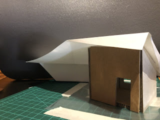
Fusion 360 Transition Space
Monday, March 23, 2020
Monday, March 9, 2020
Progress on compilation of infographics
Progress on compilation of infographics
I made progress on the combined infographic, importing the finished spider chart and beginning to match the colours. The spider graph's scheme is based on the reds and oranges of the transport graphic. I selected capitalised futura as the heading font and began to integrate these. I also experimented further with the gradient weather chart as the backgroundand began plotting out a key so this could be easily interpreted. I moved the Y axis of the column graph from the left to the right and reduced its size and labels.
I made progress on the combined infographic, importing the finished spider chart and beginning to match the colours. The spider graph's scheme is based on the reds and oranges of the transport graphic. I selected capitalised futura as the heading font and began to integrate these. I also experimented further with the gradient weather chart as the backgroundand began plotting out a key so this could be easily interpreted. I moved the Y axis of the column graph from the left to the right and reduced its size and labels.
Completed Site Plan
Completed Site plan.
My site plan as it stands to be compiled. Data for 5pm, based on a purple pastel colour.
My site plan as it stands to be compiled. Data for 5pm, based on a purple pastel colour.
Experimentation with combined infographics
Experimentation with combined infographics
Incorporating graphs I had recieved from the group I compiled these, experimenting in hopes of fiding a visually pleasing balance. I changed the pie graphs I had originally received into donut graphs for more interest and to allow space for a title within the centre. Further, I reduced the data face to a semi circle in order to create an opposite effect against another data set coming from the top of the image (the donut here stands in place of a planned half-spider chart which I am yet to receive from a group member.)
Incorporating graphs I had recieved from the group I compiled these, experimenting in hopes of fiding a visually pleasing balance. I changed the pie graphs I had originally received into donut graphs for more interest and to allow space for a title within the centre. Further, I reduced the data face to a semi circle in order to create an opposite effect against another data set coming from the top of the image (the donut here stands in place of a planned half-spider chart which I am yet to receive from a group member.)
Plan process
Plan process
Began to select colours for my plan - currently looking to make the walking lines black/grey monochromatic.
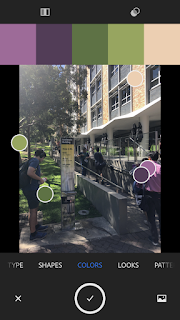
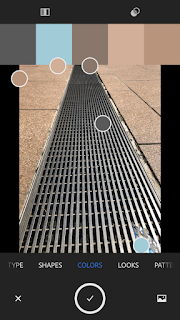
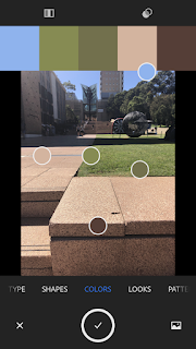
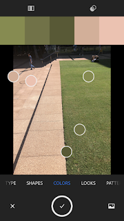
Pastel Source Image
Pastel Source Image
Our group agreed on using the following from IG: @act.of.mapping as a source for pastel colours for our plans so they were similar and compatible tones when compiled.
Our group agreed on using the following from IG: @act.of.mapping as a source for pastel colours for our plans so they were similar and compatible tones when compiled.
Sunday, March 8, 2020
Completed Transport infographic
Completed Transport infographic
We also had a group member drop out, so I began to brainstorm space efficient ways to incorporate a weather infographic into our combined submission. This resulted in experimentation with black to white gradients indicative of temperature.
We also had a group member drop out, so I began to brainstorm space efficient ways to incorporate a weather infographic into our combined submission. This resulted in experimentation with black to white gradients indicative of temperature.
Early Progress on Infographic
Early Progress on Infographic
Building a bar graph around icons with the end goal of conveying my data set without the necessity of labels.
Building a bar graph around icons with the end goal of conveying my data set without the necessity of labels.
Infographic Colour brainstorm
Infographic Colour brainstorm
Discussed with group that I would base my graph of the applicable colours of public transport iconography (i.e. Light Rail, Bus). From there they plan to base their colour schemes around a monochrome of one of my colours.
Discussed with group that I would base my graph of the applicable colours of public transport iconography (i.e. Light Rail, Bus). From there they plan to base their colour schemes around a monochrome of one of my colours.
Subscribe to:
Comments (Atom)


